JLL PAT – Product Enhancement
INTRODUCTION
My role
UX & UI Designer
Purpose of the Project
Although JLL PAT has long delivered significant value to users and generated sustained revenue for the company, the PAT team recognized that its outdated design and poor UI/UX were causing serious friction in the user experience. To maintain the product’s relevance and competitiveness in the market, JLL decided to undertake a complete redesign of PAT.
Constraints
All existing features and tools had to be retained.
User insights were gathered indirectly through feedback shared by members of the PAT team.
This was an exploratory project intended to present a new visual direction to stakeholders, with no direct user feedback available at this stage.
Budget and timeline only allowed for designing the homepage, navigation menus, and a few sample dashboard screens.
Project Duration
8 Hours
HOMEPAGE DESIGN PROCESS
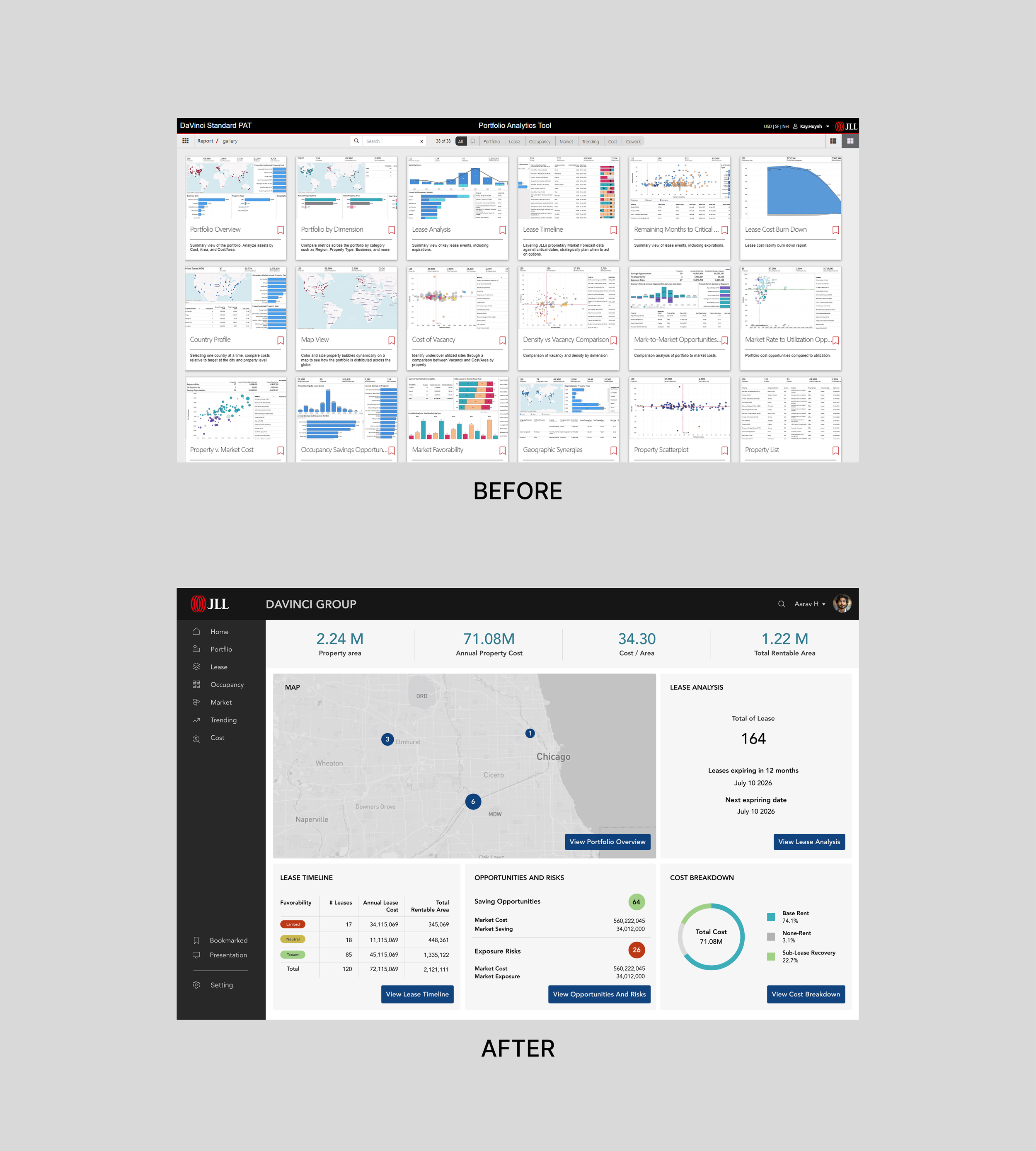
The homepage required the most design time, as it includes the primary navigation that is used consistently across all other pages. In addition, the homepage dashboard demanded careful consideration of information hierarchy to reflect what matters most to users.
Separate from the top and side navigation menus, the following section focuses specifically on the design approach for the homepage dashboard.
Analysis of the Existing Dashboard
Strength:
The only notable advantage of the current dashboard is its completeness—it displays all dashboards available for users to select within PAT.
Weaknesses:
The layout is cluttered and lacks clear prioritization, overwhelming users from the moment they enter the product.
There is no clear information hierarchy to guide user attention.
The dashboard fails to provide a concise and meaningful summary for users at first glance.
Design Approach
Conducted discussions with PAT team members to identify:
The most essential dashboards
The most frequently used dashboards
Key metrics and statistics
Additional information critical to users
These insights were synthesized from years of PAT usage data, along with qualitative input gathered directly from customer conversations.
Based on these findings, wireframes were created and multiple layouts were explored to determine the most effective structure before applying the final UI.
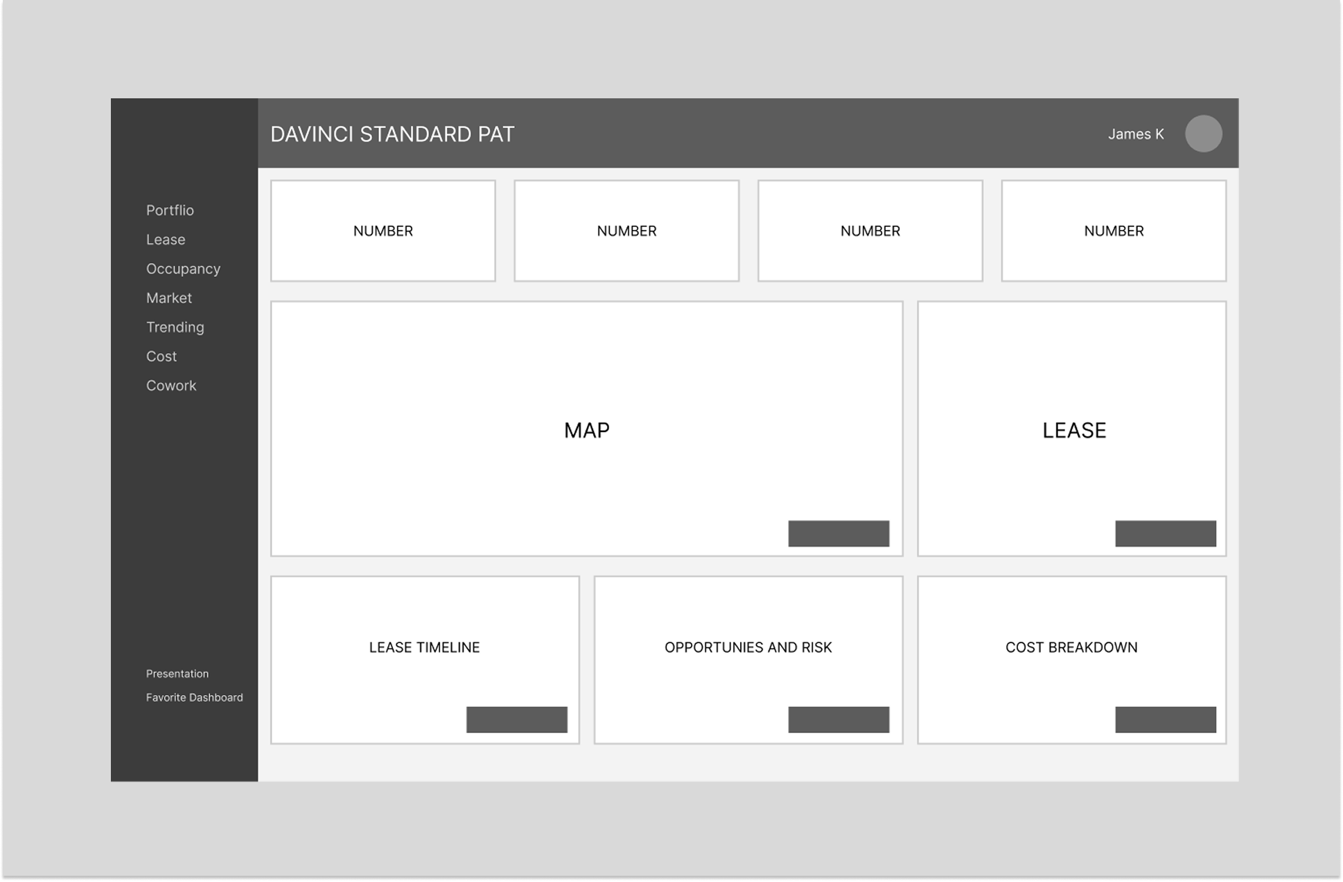
Navigation Design
The filter section previously placed at the top of the old homepage was moved to a left-side menu. This side navigation lists all dashboard categories and can be expanded, making it easier for users to clearly view dashboards grouped by different categories.
A small section at the bottom of the menu contains items that are not dashboards, so it was intentionally separated to maintain clarity and avoid confusion.
VALUE BROUGHT
Successfully demonstrated the importance and impact of redesigning PAT.
The demo design was well received by the entire team and positively validated through customer testing.
The demo became a foundational reference that enabled JLL’s core design team to further refine, finalize, and launch the new version of the product.